This is the work blog for the KDE Visual Design Group a group of dedicated designers striving to improve community participation in design for KDE as well as design work in general for KDE applications and Plasma.

torsdag 28 augusti 2014

Visual Design Stuff at Akademy 2014

For planet readers, this post is written by Andrew Lake.


I'm so excited to participate in my first Akademy this year! I'll finally get to meet other KDE folks I've only interacted with online from all the way in Seattle, my home. I'm especially looking forward to meeting some of our other VDGers like Thomas Pfeiffer and Jens Reuterberg.

I'll also be doing a session on Community Design and the KDE Visual Design Group where I'll share some insights on how the concept of community design works in the VDG, how we hope it will help to sustain visual design as a core competency in the KDE community, how to ensure the quality of the design output, and the lessons we are learning along the way. If you've ever interacted with the VDG, good or bad, or if you're just wondering how the VDG is working today or will in the future, you're certainly encouraged to stop by.

I'll also be hosting a workshop on Visual Design and QML where we'll cover using QML as a visual design tool by working through an example design. No previous QML experience is required - just a willingness to learn something new.

If you need any help or feedback with a design, you can find VDG folks in the User Interface Design Room identified on the BoF schedule.

I'm truly looking forward to this. My Czech is non-existent but I'm trying to learn a few phrases. My German is barely-existent but I'm trying to learn as well. So if you see this guy


or these guys

in the middle of a heated argument with Brno taxi driver, know two things:
  1. I probably insulted his dear mother without realizing it, and
  2. For goodness sake, help a brother out!
Looking forward to Akademy 2014!

tisdag 12 augusti 2014

Monday Report: Old Style In New Form


For the PlanetKDE readers, this posts is written by Philipp Stefan

Breeze C++

Something wonderful happened, Hugo Pereira has volunteered to implemented the Breeze UI controls style in C++ and has shown off some screenshots of his work in the forum.
The basis of this theme is the old oxygen style, so he was able to reuse most of the code. Below are some screenshots of his work (without the Breeze window decoration).


Plasma Addons

The plasma developers are currently porting plasma addons from the 4.X series to Plasma 5. This is of course a great opportunity for us to look at the design of these addons and, as the developers have suggested, now would be the best time to suggest bigger UI revisions, if we have something in mind.
Naturally this has become our main focus this week. We plan to do it this way, open threads in the forums for each add on and wait a few days to see if someone has some ideas regarding the addon. When nothing happens we'll go forwards and finalize our design and make it accessible to the developer who ports the addon in question. This seems to work fine for a couple of addons so far.

Plasma Media Center

After a short delay *cough* Andrew Lake has taken the task upon him to help out with the PMC redesign :) 
The usual process of discussion layout, navigation, usability and presentation of features has now begun. If you have some ideas then, as always, don't hesitate to share them. Nothing is set in stone and as of now we can expect to see changes and adjustments coming up.
Have a look for yourself:


Andrew has also shown off some more mockups of his music player idea. Looking good, Andrew!

This blog entry is proudly presented to you after a two day long struggle with blogger. I thank my friends and family for supporting me in this difficult time.

måndag 4 augusti 2014

Monday Report: Application Design

For the planet readers: This post is written by Philipp Stefan


Last week we saw the release of our design pattern guidelines, this week we focused on using them to prototype application designs. Some of our work has already been made public, like Andrew’s calendar prototype which saw some amazingly detailed feedback. We really love top notch input like that, keep it coming, people!
Andrew has also been working on a design for a music player. We already have a developer interested in helping us to make it a reality. As always, if you have ideas bring them on!
In another thread, EraX has released a few more excellent mockups of how he imagines a future muon discoverer to look like. If you have some time consider to give him feedback. The more feedback he gets the better the design proposal will eventually turn out, so don’t shy away from involving yourself :).

A few users also have kickstarted the work on a better tags GUI for Dolphin. Unfortunately we, besides Thomas, didn't have much time to respond to this proposal. We hope to reach out more throughout this week.
Additionally the work on redesigning the desktop configuration dialogue has started off. Some rough ideas have been sketched out, but nothing is final yet. We’re still arguing about what has to be included where. Currently it seems that there is no winning proposal in sight. Though, I’m sure this will change in the course of this week.

One project I’m personally very excited about is the work of designing an API that makes *PIM's mail functionality available via QML. This will enable us to be able to write e-mail clients in QML or use KMail functionality in e.g. plasmoids. The developer behind this task wants to make a prototype client to see what’s needed in the API to work best for developers. 
We come into play by designing the prototype client. However, the VDG hasn't quite finished the mockups yet, so it’s your time to shine. A few users have already responded with feedback and mockups of their own. Currently the discussion is focused on interaction patterns and the general layout of such an e-mail client, so in its very early stages.

Besides these application the VDG is also working with developers (or without) on an image viewer and a video player. Besides that we want to make slight improvements to key areas of Plasma 5 e.g. the system tray. As you can see there’s still much to do, but we’re pleased with the progress made so far.

*I falsely wrote that the API would expose KMail functionality, when it in fact makes KDE PIM's mail functionality accessible via QML, my apologies. 

måndag 28 juli 2014

Layout Guidelines: A quick example

For planet readers: This post is written by Andrew Lake

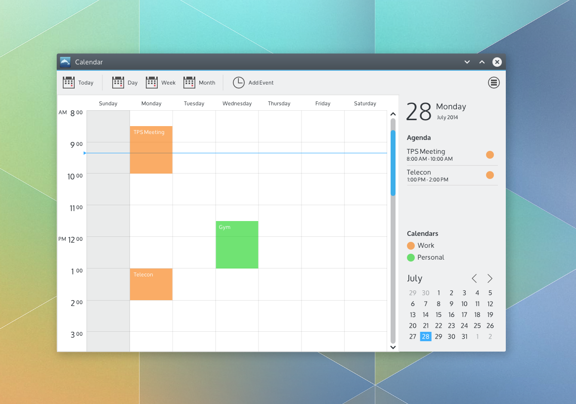
We recently released new layout guidelines to aid with designing applications and plasmoids. So I wanted to provide a quick example of how to use the guidelines to design the layout for an imaginary calendar application.

A quick design for an imaginary calendar app

To choose an application layout, the new guidelines encourage awareness of the functions and commands provided by your application as well as the structure of the content provided by your application.

So let's start with commands. Suppose we want the primary function of our calendar application to be providing a daily, weekly or monthly schedule of the user's upcoming work or personal events. The user, Sue, would also like to be able to add events to her schedule. There are many other functions for a calendar application that I'm sure we're all aware of. We're not designing in a vacuum - there are many calendar applications from within KDE and elsewhere from which to draw inspiration. For the sake of this example though, lets start with the described functions and commands.

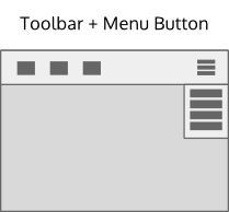
The guidelines suggest layout patterns for simple, complex and very complex command structures. So where does our calendar app fit? Well, I wasn't quite sure either. And that's ok! Some things are tough to know until you start delving into the design work. The guidelines suggest starting with a pattern for a simple command structure when you're not sure. So that's what I did. As I started putting together a design and thinking about how Sue would use it for the purposes described, it became clear that not only were there several other desirable functions (like switching calendars, setting up calendar accounts, setting calendar colors, and more) but there are also certain commands Sue might use quite often (like switching between a day, week and month view of her schedule, adding an event and quickly getting back to today after browsing forward or back in time). So I settled on the suggested Toolbar + Menu Button command pattern for a complex command structure.

The mockup toolkit provides an example:


The content structure for a calendar is pretty much flat: Just a collection of days (with or without events). I wanted to show a single day view, a week view(7 days) or month view (28 - 31 days) as well as properties related to the current view or selection like the date, the agenda for the current day or view and the active calendars. So I settled on a Selection-Properties navigation pattern from the recommended patterns for a flat content structure


The mockup toolkit provides an example of a Selection-Properties navigation pattern combined with a Toolbar+Menu Button.


Now I have a basic layout I can use for the rest of the design work. I put what I think will be the most frequently used commands on the toolbar - Today, Day, Week and Month views as well as a command to add an event. 


Many of the other commands like setting up calendar accounts and the like are exposed through the menu button. I design a week view using the recommended design color set and occasionally checking the typography guidelines. For the properties panel. I draw some inspiration of Sebastian Kügler's great design work on the new clock plasmoid panel popup for the current date to achieve some additional visual consistency with the desktop. I also decided to add a mini month view for convenience and a legend for the active calendars (possibly directly editable?).


Put it all together and we have a quick design for an imaginary calendar application. 


It's not a complete design in any sense of the word - icons, day and month views aren't shown, nor are calendar settings and the like. But it's probably enough to, for example, start a review on the VDG forums to get feedback from our fellow intrepid designers, the usability team and/or potential developers.

Just to be clear, you still have to design. Design is a creative activity. While guidelines can provide a sandbox, it still requires creativity within that sandbox. Often that means that the best way is to just start and figure it out as you go. For me, that's usually a bumpy trial and error process which I simply accept rather than agonize about. And no, you're not allowed to declare that you're not creative! :-) 

Always feel free to ask for help or feedback on the VDG forums - it's a great place for us to learn together. This design was done using the mockup toolkit, but just use whatever tool you're comfortable with, including just sketching on paper and taking a picture of it. Don't wait. Don't hesitate. Just do. The long term hope is that these new layout guidelines will provide enough flexibility to create layouts suitable across the full spectrum of KDE applications while also helping to achieve layout consistency where it makes actually sense. Like all guidelines, it is a living document which we'll update collaboratively over time. We'll also do more examples like this in the future.

Hope this helps!


Monday Report: Creating Documentation

Yesterday we reached a small but important goal, we completed the first of our self-set tasks for this cycle, namely finishing our application layout guideline. The guideline has been presented to the community to gather feedback and was moved to the HIG wiki yesterday.
If you think something blatantly obvious has been overlooked, don’t be afraid to speak up. The guidelines can always be improved. Keep in mind though that we intend to make more visual examples available in the guidelines. As of now we were mainly concerned with the textual content of the guidelines.
The guidelines are intended to standardise which layout elements KDE applications use and to help pointing out which layout is best suited for a specific type of application.
Additionally to the release of the application layout guidelines Andrew Lake has updated the mockup toolkit with some examples of how one can use the layout guidelines in combination with the toolkit to prototype application designs.


Another project that starts to take shape is the next network system settings module. This module is intended to be one of the first with an updated design for the new system settings.
This work is in its early planning phase so if you have something important to say, chime in!

On the window decoration front Martin Gräßlin has blogged about the advances he’s made. If you haven't seen the blog post yet give it a read, it provides very interesting insights in the internals of KWin’s new decoration API. Now it’s time for us to work on the details like padding, etc. We're very pleased with the amount of progress being made, which shows again how absolutely awesome the KDE developers are.

Community

We are very happy to see the increased community activity in the forums. Last week a whole bunch of new users arrived in the forums and started to give all kinds of useful feedback and ideas.
It’s very impressive what a difference a few motivated individuals can make. We hope to integrate all of you into our workflow as good as possible and try not miss any of your ideas. If this should happen anyway don’t be afraid to voice your ideas again.

torsdag 24 juli 2014

A wild "monday" report appears …

Arguably our insanely-coolest member, Philipp Stefan contributed this "monday" report.

Yes, it has been some time since the last entry, but with the Plasma 5 release and Jens’ busy work schedule there hasn’t been much time for him to write one, unfortunately. I hope I can keep you up to date more regularly from now on. So let’s dive right in:


What’s being worked on

The work on revisiting and expanding the Human Interface Guideline on tooltips has begun. If there’s something that has always bothered you about how tooltips in KDE Applications and Plasma look and feel consider to join in. The work is still in its early stages, so now would be the best time to voice your concerns. [https://forum.kde.org/viewtopic.php?f=285&t=121892]


Martin Gräßlin has started to work on a new window decoration API for KWin and is also working to port the Breeze window decoration to C++. This should bring the necessary performance boost to make Breeze the default window theme in future releases. We can also expect one feature many love in Oxygen to be present in the new Breeze implementation: window tabs. The awesome community member EraX has stepped up and made some mockups of how window tabs could look like in Breeze.


If you have other ideas and feedback, consider to chime in!
Additionally Martin has created some tasks you can take up to help us out porting Breeze to C++. Take a look at Martin’s blog post for more information [http://blog.martin-graesslin.com/blog/2014/07/kdecoration2-the-road-ahead/]


Behind the scenes Jens Reuteberg and Heiko Tietze has started to collect information for animation guidelines. If you have an expertise in this area or are just generally interested and want to help us out try to contact them. [https://forum.kde.org/viewtopic.php?f=285&t=121993]


We migrated to KDE’s new todo-board infrastructure, todo.kde.org. It’s really nice having everything consolidated in one place and accessible with one’s KDE-Identity account. In future we also hope to migrate away from Google Docs and Hangouts. We have been looking into something like an OwnCloud installation to create, share and store documents. Nothing is written in stone though and frankly we’ve got more important things to do right now.  


What has been overlooked

We have noticed that the participation rate in the VDG forums has plummeted and only a small core has remained, which are doing awesome work! It has to be expected that participation rates decline at the end of every release cycle, when all the work gets finalized there’s not much to be discussed after all. Nethertheless, we’d like to recreate the same experience we had with the KMyMoney, the window decoration, the widget and the cursor theme.
We identified several causes that could have contributed to the decline in participation:
  • Back then the VDG forum was new – people simply got disinterested over time
  • The VDG hasn’t communicated as much as in the beginning – the process became less transparent
  • There has not been as much guidance in where to start helping out as in the beginning
We try to address these issue better from now on. We have reorganized ourselves a bit, so you can expect more blog entries from more VDG members in future. We also intend to open new “challenges” (not in the sense of a contest) at the beginning of each release cycle where the community can participate in.
Please tell us if you have ideas how we can foster a more vibrant design community in KDE, critique happily appreciated.
We also have a thread in the forums about a related issue. If you feel the same way consider to leave a comment.

Overall I can only encourage you to browse the VDG forum. There are many interesting threads that could need some community love.

söndag 13 juli 2014

The Road Ahead

Plasma 5.0 is wrapping up and we have all learned a LOT in the first few months of the Visual Design Group's existence. One thing is clear though. If any of us had any doubts about whether an open approach to visual design can produce great results, most of those doubts have been assuaged. I'm super-proud to be part of this community and the quality of the results we have produced. It is really exciting to see the participation and the optimism by everyone involved!

So one question some folks might be pondering is "What's next for the VDG?" Well I'm glad you asked. The core VDG group sat down and looked at the long term approach to supporting the Plasma desktop and KDE applications.


Plasma 5.0 is a beginning, not an end. Just like on the technical side where the focus was on the laying the foundations for the future, the same can be said for the VDG's activities as well. We worked together with the wider VDG community and the Usability group to come up with design guidelines that are now integrated into the Presentation section of the KDE HIG. This is a living document and will see continuous updates. We recently updated the typography guidelines and have just begun work on coming up with tooltip and animation guidelines. For the Plasma 5.0 release much of our focus was on trying to get the design of the building blocks in place (UI controls style, icons, colors, cursors, window decoration, etc.). These should also be considered "living" as well. We need your help to flesh out more of the fantastic Breeze icon theme effort that Uri has been leading. Design work continues on the Breeze window decoration design in the forums. The Breeze plasma theme will always need refinements and evolution as well.

Beyond the building blocks, we'll be focusing on identifying common application layout patterns, navigation patterns, as well as more localized, functional patterns to help application designers and developers build consistent, beautiful, powerful solutions. The hope is that over time we will build up a set of resources that will enable the entire KDE community to more easily create total user experiences that are both functionally and visually amazing. (About that last block in the diagram; please don't go about saying that KDE is creating an OS. We are not. That block is simply about designing the total user experience assuming all the underlying layers of the OS have whatever capability might be needed).

One important clarifier though; we don't need to wait until all these pieces are in place to create new designs or improve existing ones. We already have a great foundation to build on. There is much we can do today to improve our existing designs. More importantly, your creative ideas today will inform what we identify as desirable approaches to design both today and tomorrow. That's why we're working on the System Settings design today. That's why when a developer approaches the VDG for help we will always try to help instead of saying "hang on a bit till we get some more stuff in place". This is a continuous process of learning and improvement for everyone.

So please, don't wait around for all of this to "finish" to start sharing your ideas or helping to improve things. There is no finish line. Join in on the fun today and help to update an application design, application icons, a dialog window, a panel applet, a window decoration theme, a plasma theme, fix a visual design bug, whatever. As Jens always says, you do not need to be a "designer" to participate. Just be creative! Be positive! Share your ideas! Participate! We will walk the road ahead together, in the open, where everyone can participate, learn from each other and create a new future for community design together!

lördag 28 juni 2014

Wallpaper Challenge - winners

In which we go through the winners of the wallpaper competition, talk about voting issues and where we go from here

Nuno's wallpaper the default wallpaper for Plasma 5


The Heat is on! 
Right it's getting closer and closer to the D-day of Plasma and things are getting hectic. All of us are wild at work and things are getting cooler and cooler. But the wallpaper competition is at least finished and done with for this release which is nice :)

None of this could have happened without the help of Sogatori who has been a prince in shining armor and earned enough good Karma to last a lifetime as far as I'm concerned.

Sogatori Speaks! (below is written by S)
After two weeks and almost 1400 casted votes we’re finally ready to announce the 3 winning wallpaper submissions:


Congratulations also to the 3 winning artists namely orbmiser, ivan and mck182 who is the third runner-up, all of whom can look forward to receiving a copy of the excellent book “Design Elements: A Graphic Style Manual” by Timothy Samara. We’ll contact the winners shortly so they receive their prices as quickly as possible.


Some Small Hiccups
Those of you who have kept an eye on the election might have noticed that the website we were using displayed a different result than the one we’re presenting here. The problem was that Sogatori clicked the wrong checkbox when he created the election, the website was using proportional representation to determine the winners instead of a non-proportional one. It is not possible to change this option after the election process has started and at the time we noticed the mistake there had already been over 500 casted votes, so we decided against opening a new election. Instead, we were able to download the data from the website and re-run the election locally using the same software as the website. Special thanks to bshah (Bhushan Shah) who helped us despite having much to do with his GSoC project. A big thumbs up please! 


onsdag 11 juni 2014

Wallpapers! Vote for your favorite!

This post was written by Sogatori who has been a rock during this process. I want, before we continue to just have a massive High Five and "You rock!" sent to Sogatori for being such a stand-up dude during this entire process. 


The Wallpaper Contest!


We’re glad to announce that the contest has been a success with over 50 submitted wallpapers.
After the submission phase closed on June 6th, a jury of 3 (1 VDG member, 1 forum member and 1 plasma developer) selected their favourite wallpapers.
The submissions ranged from photographs to artwork. Those who want to take a look at all the submissions that didn’t make it into the finale can do so by looking at our deviantart group and this forum thread. It was no easy task to select the wallpapers for the finale, considering how many great submissions we received. We would like to take the chance again to thank everyone who has taken part in this contest. You are the people who make the KDE community what it is. It’s a pleasure to work with you all.

Now though it is time to move on to the next phase of the plan: The greater KDE community now has the chance to vote for their 3 favourite wallpapers out of the 15 nominees. The winning wallpapers will be shipped with the first release of Plasma Next. Additionally the creators of those 3 wallpapers will receive a copy of the book “Design Elements: A Graphic Style Manual” by Timothy Samara, an excellent introduction to the basics of the world of design.
You can vote here. Simply rate the individual wallpapers on a basis of 1 to 5 stars, where 1 star is the worst and 5 stars the best rating, and submit your ballot by clicking the “submit ballot” button at the bottom.
The vote will end 2 weeks after this blogpost has been published.


(Jens Addendum: ok so if you want to talk about the wallpapers and not just vote - please do so in the community thread! The more talky-talky the better! Also, IF by chance on person gets two of the three highest votes one book will go to Number Four on the list (because what are you going to do with TWO books? Better to spread the love around)

"Monday Report" - bi-weekly edition

In which I complain about having too much to do, then start going all insane about all the cool stuff you so need to see, ask you to test the Plasma 5 beta2 and then on to the wallpaper competition and the last leg of that.

Right first off - I am swamped. I know it's not good that I skip the monday reports but lets just say I had to cut down or something or skip sleep entirely... sry guys, I know reports are relevant, but not as relevant as "working on Plasma Next and Next-next" (yes there is a Next-next in the works :) ) so I hope you forgive my tardiness.

...

Right on to the awesome stuff. The screenshots are all from Sebastian "Il Capitano" Kügler who is hacking away like his life depended on it. These are all "where we are now" - and check below for "where we're heading" hints.

This is the new login screen - there are plenty of fiddly bits to deal with but it's the first step towards making a unified login experience. Yes the work is still far from over but it's getting closer every day.


 So you've logged in have you? Well this is what you'll meet all the system tray icons have been reworked the new Plasma Theme "Breeze" is there and you can see the new wallpaper switcher as well as the new layout for the Application Launcher. Please note that Breeze is transparent - only that its transparent with some dark magic by Marco Martin making the background fuzzy and desaturated.


Below is the new battery and brightness tray in the systray. Notice that there are two screenshots, one with the layout as is and one with the new icons. The icon sizes will be fiddled with but when have I ever NOT shown you guys and girls some work-in-progress love?


So the switcher has gotten some revamped workings too based on the Activity Switcher by Ivan Čukić to try to make the entire feel of the switching a tad bit more unified and safe for users.


 Below is a pop-up for a new message - now granted not much of a change BUT the work is being done on the layout of the thing. Essentially the Icons size in comparison with the Header and the subheader.


Here's the new Networks Systemtray dohickey - you look me in the eye and tell me that isn't the most awesome thing you've ever seen! As you can see a MASSIVE part of the work has gone into trying to make Plasma feel more unified in its design, trying to make it part of an entire whole instead of different details. The work is far from over but you gotta admit, this is nerve-tinglingly (should be a word) good!


The calendar... Now now before you go all bananas and think "Where's my daily planner bit!?!" the reason it's disabled is because we don't have support for it in PIM just yet. So better disable it by default than bring something that doesn't work amirite?

Also note the Breeze windowdeco. It's there now :)


...

Where can I get my greasy mitts on all this magical goodness you ask? Well young madams and sirs you can download and test the Beta 2 of it following the instructions of Jonathan Riddell on the Dot remember that this is for testing only. And please please please write in bugreports and test it thoroughly the better its tested the easier the work becomes!

...

Wallpapers! What about the wallpapers? Well the competition is at its final stage. But hey I'll post ANOTHER blogg post in a few seconds ok? It'll be easier for you guys.

...

Oh oh oh before I go any further I will whisper to you all a secret... "The system settings are being worked on and although its to early to show anything... lets just say when I saw the current version of them I went "ooooh daaaaaaaamn!" so loud my husband asked what was up" ... I cannot explain how brilliant this will be... ooooh! :D:D:D


Ok I gotta dash, have insane amounts of work to get to and I'll try to do these things properly each week but IF I don't rest assure that the only thing stopping me is because I'm working on something brilliant!


torsdag 29 maj 2014

System Settings and new VDG members

In which we introduce the work on System Settings, talk about our new members and the action group for System Settings.


Right, a while back we had some additions to the VDG team: Anditosan, Gartheco and Ken300 - I promised then that I would make little avatar images for them (which I haven't done, mea culpa etc) but that doesn't mean they've been resting or doing nothing.

Gartheco joined Andrew Lake in working with the new window decorations - as I've posted about before. Being a veteran Aurorae theme designer and a QML genius he and Andrew work in tandem to fiddle with bits about that.


Anditosan and Ken300 where both doing work on System Settings redesign and joined forces with Heiko Tietze and Thomas Pfeiffer from the HIG team to work on the question "How will system settings work in the future?". Together they make up the System Settings Action Group (it's like a superhero team, only less spandex and more thinking) and if you want to contribute with ideas I can only suggest that you go to the forum and post your mockups and help out!
Now with System Settings this is a "way into the future" job - because we are working on the "bit-by-bit" production model AND lets be frank here, the devs are more or less working 24/7 getting the first version of Plasma Next out the door.
But this is what system settings will work like in the future - it's what they work on that will shape the things to come.


Also can I say something that is cool? I am right now struggling to keep up. My intray is massive, I keep trying to read blog posts and forums posts as fast as possible. Individual members of the VDG community are doing awesome work in the forums and I can hardly keep up. I spend hours trying to answer one thing and work on it, then notice someone else have already done it.
This is the coolest thing I've ever seen. Yes it's kinda harrowing but it's amazing the amount of work done.
Tomorrow I'll have a "what Jens need to do" day, and start making lists and tick them off one by one. My greatest challenge for the near future is getting the right design work and designers in contact with the right devs... THATS the tricky bit right now and where I should spend my time.

Why? Because whatever work I can do, the VDG community is doing it quicker, better and cooler than I ever could alone.

You guys and girls ROCK! <3

måndag 26 maj 2014

Monday Report: Wallpaper Edition

The world shortest update in which we talk about the wallpaper competition, whats needed, when it ends and what we need and what you can win.  


Wallpapers are relevant, yes they are easy to change - and yes they probably shouldn't matter since everyone changes the wallpaper but it's one of those things you see first. So a few weeks ago we started a wallpaper competition and we have gotten some great wallpapers sent in but we want more.

The wallpaper competition will therefore be extended two weeks so more can take part in it.

So how does it work, you ask? Easy, our three members of the Jury, Me, one from the community (Sogatori to be precise, if you wish to want to send bribes) and one member of the Plasma dev team will pick out the favorites and with the help of the community pick out the three winners who's wallpapers will be included in Plasma Next.

The three winners will get the awesome book "Design Elements - a Graphic Style Manual" and of course a worthy mention.

So what are we looking for? Photo wallpapers, illustration wallpapers or graphical and abstract wallpapers are all accepted for submission, personally I would suggest to avoid text elements or logo's entirely - the theme we're going for is a hopeful futurism but this should be considered something to focus around, not a prerequisite.

The submissions can be posted in the Deviant Art group or in the thread here in the forums. If you have them elsewhere post a link in the forums.

How about licensing? Well this will all have to of course be yours to licence and done as Creative Commons Attribution-Share Alike 3.0 or GPL v2 or later. 


THE COMPETITION ENDS AT JUNE 12th

måndag 19 maj 2014

Monday Report: Deluxe Edition!

In which we talked about the "Conspiracy of the Missing Monday Report", a short thing about the Beta and then some screenshots of where we're heading concerning themes and icons and then talk some more about participation and how much it means.

I forgot.

I know, I know, no Monday Report last week - lets just keep it at "its been kinda hectic lately", "I forgot" and move on. Monday reports are continuing no matter what so don't worry about that. :)
So I will post this and then ANOTHER post soon after to delve some more into the work going on with Wallpapers and the wallpaper competition.

To the Long and the Short of it: We have a Beta as most of you have read. What shocked some is that the beta wasn't a major change in visual design. No, it wasn't intended to be. I've said back in January, over and over, "bit-by-bit". This will be a slow change and let me delve into the "why's".
Plasma is a massive project, it has millions of users and a long history. What started as another Linux Desktop Environment has grown and grown with layers and layers of function. Now some of you might say "Well scrap all of them and build it from scratch" and for a mission with less demands that would be true. Plasma is a MASSIVE project for a reason. One of those are that the users who like the way it is NOW should not feel dismissed, another was that changes had to stick to an obvious layout path from KDE4 another that flexibility should never be compromised and a third that "Community" should always be the focus etc etc (or as a friend said when I told him about the project "What, are you stupid? Why are you doing this!?" ;) ). So bear with us, things are changing but we will do it slowly.

Anyway I wanted to show two screen shots of where we're heading. The first one is from Andrew Lake who together with Garthecho (a new VDG member) heads the work on QML and is tied into almost every bit of it. You can see the new window decoration (that needs to be properly ported as right now we have an Aurorae theme for it but Aurorae doesn't play nice in Plasma Next (so if you're a C++ programmer who likes to get his/her hands dirty, tell us!)) and you can see what Plasma looks like too as well as the Widget theme and a few of the Icons.


Under here you can get a nice good look at Uri Herreras icon work so far. Now Uri is one of life's many overworked people who tend to take on quite a load when he gets a chance so if you want to help out with Plasma Next, try to help HIM with his Flattr Icon theme so that he gets more time to do our theme (yes it's as confusing to write as it probably is to read :) )


Please note that they window decorations, Plasma Theme and Widget Themes are for Nitrux OS and not Plasma Next!

Ok so finally about participation - I know since things move slowly it might be tricky and many seem to think that they are being overlooked or that no devs are checking their work. Trust me, nothing could be further from the truth. It's just that things WILL move slowly. We're working on Plasma Next. That means that when this Beta is out the door we will still be working on its refined state. Plasma as it will be in June, is not the final product. It's just the first iteration of it and my intention is that when this year ends the changes will be visible to all.

torsdag 8 maj 2014

Moka Icon Theme Ported to Plasma!

In which we talk about the porting of an immensely popular icon theme to Plasma, the relevance of Plasma and KDE people to donate a little cash, learn Sam Hewitt wasn't born in 1956 Berlin and here his opinion on design in Plasma

Not at all the icons we're talking about...
Whats all this hoo-haw about icons then?
One of the first things people think of when talking visual design is icons. Now as "design" this is a very tight definition since a large chunk of it is so much bigger. But icons is a part of it all and it is something that is the most obvious change visually. Icons are also something very very difficult to do well as there is not only several very strict rules and concepts to consider while doing them, there is also a very large amount of work involved (thousands of icons for starters). Beyond that there are issues that make it even trickier.
As icons are very direct visually - they are often victim of harsh criticism (or downright harassment) but further than that the BASE theme of a distro have to follow even stricter rules if it want to be accessible to as many as possible.

Now we using Plasma do not have the huge wealth of icon themes as the boys and girls over at GTK, but we are getting there ever so slowly and today I would like to present one of the latest icon themes to get ported to KDE - Moka by Sam Hewitt.
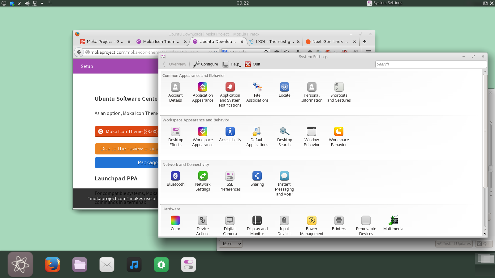
Yeah so this is one of my desktops with the Moka icon theme!
I obviously talked to Sam and sent him some questions to answer which follow below but before we get there I would like to say that you can download the icon theme from his site and, as one Plasma user to another - Please for our sake pay for it. You can afford the 3 bucks if you got a job and what you do when you do that is to send a clear message to Sam and other predominantly GTK designers "We want design in Plasma, Qt and KDE too!"
(in a perfect world I'd love for Sam to see a bump in payments OR donations (I gave 10 dollars) so remember to donate, ok?)

Anyway heres the short Interview with Sam Hewitt:

...

Who are you?
Who am I? Well, it was 1956 and in a small town in East Berlin it was a cold December day. But Berlin is always cold in December. As for me, I'm from Canada and the '90s
Nearly all the things I've found that I'm good at, I've taught myself, design included; I dropped out of university a few years ago, half-way towards an engineering degree that was killing my love of mathematics & physics. It was after that that I kind of fell into design as a passion and decided to pursue it –open source was simply an enable
Whats the story with Moka?
Moka started a little over a year ago, I can't remember exactly when. I had decided to create an icon theme, as an hobby/endeavour in teaching myself more about Inkscape –Moka then was very different from Moka now.


... heres the early versions of the Moka Icon theme ...
I eventually abandoned the skeuomorphic aspects that I started with, as that was already done by others and it wasn't really my style. Changing gears, I decided to to fill a gap in the theming community of a well-designed, comprehensive icon set that was modern in style. Then I decided I wanted to do a desktop (GTK) theme, which became Moka GTK. Purple as a motif was something no-one was doing; there are colours that are frequent in themes –blue is in many and is highly overused in my opinion.
The whole "Moka Project" is relatively recent, but with the project as a unified thing I started making other subproject and using Moka as an umbrella for it, and here we are.

What do you expect of Moka further along the line?
The future of Moka is uncertain, its fate is practically determined by my fate. Being the sole force behind Moka, should I decide to move on the project effectively halts. It's a reason I (made attempts to) set out to monetize it. If it made a few bucks I'd be motivated to work on it more since I would know there was an appreciative user base to work for. With all that there's a set of flaws I won't get into here.
As for future design plans, it's all up in the air. If I were to start anything majorly new (like a desktop environment), I'd do it outside the scope of Moka –have it hold it's own brand, to which the Moka brand could be applied.

Why did you port it to Plasma? 
I ported/expanded Moka's icon coverage to KDE because it was something I always intended to do. A goal for the set was to be as comprehensive as possible. Moka, excluding the Faba icon set, has nearly 9500 icons (I design 7 icons for every 1 application) and I still take requests (of which I still have a huge number outstanding) for additional icons. I want people to be able to use the icons on whichever environment they want and have the same experience.


What do you think are biggest design issues with Plasma? 
I tend to stay away from overtly criticising the various desktop environments, but since you asked, I'll say something brief. I can sum up the flaws (as I see it) of KDE/Plasma's design practices, thusly: 

"Too Much Bling"

Simply put, there's too much stuff –kill that silly bouncy ball already! ;)
The amount of user interface and user-facing options, I can see as being overwhelming to newcomers, which means it's not outwardly user friendly. Sure, the style could be modernized; the look & feel is too flashy, glow-y and realistic for a design world gone flat. But were I a benevolent dictator for the project, I'd fix the user experience first and then layer on a new style.

...

More to come?
So with that we will hopefully leave Sam to notice a bump in donations and payments (did I say "pay for it, for KDE and Plasma's sake"?) and perhaps we might charm him into a making a Moka Qtcurve and color theme? My plan is to next time we talk outside of the "monday" reports I'll have a collection of my favorite free wallpapers found on the web and perhaps another short interview.

Till next time, its now two in the morning and this design is dying to get to bed!