 |
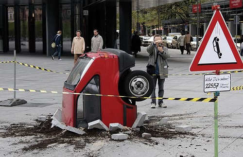
| "accident" Creative Commons SA |
Ok so last sunday I presented the awesome work by Acidrum and Uri - the day after, we hit a snag.
Essentially there are a lot of trademarks rushing around the application icons. Plenty of companies have trademarked their logo and icons and that means that by law they have to enforce any abuse on their icon work (abuse= any change).
Now for an icon theme being posted on KDE-look or Deviantart (check both places out btw, there are a mass of awesome icon theme's there), this is not an issue. Usually, even though companies are aware they exist, they turn a blind eye (which is nice) but in the case of the vanilla theme for a huge DE like Plasma - that is probably a no-go.
This means that the solution is asking these companies to create icons for their software that fits into the design language we're going for, which tend to be fruitless (I'll be reaching out to some companies shortly to at least ask nicely).
We are too small to influence them, but too big not to get sued - is the long and the short of it.
Considering that half the idea was to have a unified look the break these applications would create would ruin the effect and make the whole point sort of missed.
This was a few days ago - I had the bitter job of telling our icon designers that it wouldn't fly and "can you please start from scratch?". Icons are a huge deal - they are the most easily commented on detail of a desktop (tiny images, easily lined up and an easy design language to get into) but they are also a massive amount of work. Not only to implement but to set up.
So this week Uri Herrera, Acidrum and Nuno Pinheiro have sat down to hammer out a new design goal for the icons that fits into the design goals of Plasma that are new, that can contain odd-icons without breaking the theme and with all the relevant bits-and-bobs that any icon theme may contain.
The second they feel comfortable with the sketches they have I will of course post it here. :)
Now this was my fault - 100%. I should have foreseen this issue and can only apologize for the delays it may be for everyone in the community but also to our icon designers that had to have that horrible sensation of having their hard work put on hold and scrapped. It's not something a designer should have to go through and its the job of a Project Lead, me, to ensure that doesn't happen.
It won't happen again.
Soon it will be Monday and a new monday report will go out - that one will be about ideas for the theme.

Can you give an example of such problematic icons?
SvaraRaderaFirefox and Chrome comes to mind.
RaderaI see. But how is it that you want to remake their icons to begin with, if they're not part of the KDE project? Shipping those icons is the job of Mozilla and Google, not KDE...
RaderaBut yes, keeping in mind that there will always be programs that ship their own icons that don't follow any guidelines is important. Expecting them to be monochromatic or square won't work (but perhaps you can go around that by drawing the icon on top of a square, or postprocessing them etc.). But yea, maybe you can come up with an idea that works by changing design goals, too.
But the iconset the guys were qworling on could still be put in kde-look, couldn't it?
SvaraRaderaYes but what we need to focus on is a new default theme - so until that is done there's no time to set that up as well.
Raderathe problem is mostly about application icons, other icons that fall under the freedesktop naming umbrella are ok.
SvaraRaderaso mimetypes and action icons we will have greater control over...
Application icons we will never have a consistent look based on say shapes like for example iOS or android... were new applications being submitted o a store should obey some sort of style guidelines as far as icons are concerned.
Having said that it does not mean that we cant achive consistency across icons in the style, and make them live nicely enough with unstyled icons.
Ok, now I understand what you were trying to achieve with the square icons. I was perplexed as application icons would render all your attempts to create a consolidated alignment scheme moot. I realize now how ambitious your plan was! Well, I'm sure you guys will figure something out. Good luck!
SvaraRaderaHeh hopefully it will work out for the better. Nuno, Acid and Uri seem to be up to something awesome :)
RaderaPlus its always better to aim for the moon - you might not succeed but the crash will be so much cooler than if you just went for the tree tops
Den här kommentaren har tagits bort av skribenten.
SvaraRadera