 |
| From Marco Martins blog and Desktop. Plasma Next. |
What a week, what a week... One of my favorite things is going in to the VDG forums at the KDE-forum and read and reply to posts. There are too many awesome things to talk about going on and ALL IN THE OPEN. Some would call it "design by committee" I call it "social design work"!
...
First off the Awesome Community Icon's need a mention. The idea came from a while back when a proposed set of monochrome icons to be used in applications and widgets based of the Awesome Font was talked about. It never really got further than that but now that work has started up again in earnest. The idea being to make a simple, lean and above all symbolic icon language to be used in Open Source projects and KDE projects especially. By being monochrome, it can also use the coming effect of changing to the color of the chosen text color in the color theme.
Right now a group of community members (me included) are sifting through the available icons and sorting them into the correct places, community member Davidwright will then work it into a git-thing and hopefully a member of the VDG will sort out a project page with all icons accessible and nice so anyone can use them. Hopefully we will also be able to describe all icon sets and what the name of the icon mean so further icon design work is made simpler.
We're also hoping to include monochrome versions of LegnaVI's Krita icons to create some kind of unification in this project, trying to make all KDE apps to use the same iconset.
If you feel like helping out KDE, join in the fun and help out - the beginning of the thread has links to the Google Spreadsheet we're using for work and the Awesome Font page we're using as base for all icons. Do it!
...
Then Leroux also finished his network icons that I posted about earlier and I suggest anyone who feels a passion for icons and themeing should check them out and perhaps use them in a theme (contact him so you guys can collaborate). Hopefully we will be able to use part of them in the AKI (yes "Awesome Kommunity Icons").
A wild debated has started about a new form of sidebar in the forums - a plethora of mockups and design idea's are being hammered out and I for one is right now lurking in the thread reading every little idea and notion with interest.
(Future Plasma Design leak: part of the design ideas are being used in the sketches for the next Plasma Kickoff Launcher... don't tell anyone, iiih exciting)
The Kmymoney project is also shaping up nicely - due to the brililant work of community member lucashappy, they now have a new application icon and thoughts are being worked on working the AKI icons into a future design for them.
Now there is also a large debate going on System Settings and the future of them in the forums. For now it will be a slow and bit-by-bit thing but when it takes off a large chunk of the work is done so far so if you want to get in on that, join the debate!
The System Settings also had a split today in how we handle Desktop Effects. Due to technical reasons it was split into Compositing and [Desktop Effects]. One being more technical and "please don't play too much with this" and the other the same collection of effects we as KDE and Plasma users have come to love and adore. That means naming should be talked about... and it is! In the forums!
Now all this is to say: if you have a problem with something, you have an idea how to solve it - we have a massive community, together we can fix things design-wise, we can come up with new ideas and amazing concepts in an air of togetherness, kindness and cooperation. So don't just say that you don't like something somewhere on a blog, write a proper suggestion for a solution (without smacktalking anyone, respect is key) in the forums instead. Join in the fun!
...
Also this week I have been installing different kinds of desktop environments to check them out and see how they solved their issues. The plan was to post that report yesterday (along with an illustration tutorial) but things got in the way so it'll be coming next week.
Safe to say, don't expect any "Unity/Gnome/Openbox/whatever sucks!" texts from me. I have nothing but admiration and respect for the work done by ALL Open Source and Linux designers. All. Even if I use Plasma by choice it doesn't mean I have to hate on them instead of seeing how they did different. So this is my shoutout to the designers of those desktop environments: "Great work boys and girls, you're an inspiration! <3"
Also I will start writing a column in Full Circle Magazine about Open Source and Design which will have its basis in my experiences with the KDE Community and the design work there. I think the first short one will be in the next issue.
...
 |
| From Marco Martins blog and desktop |
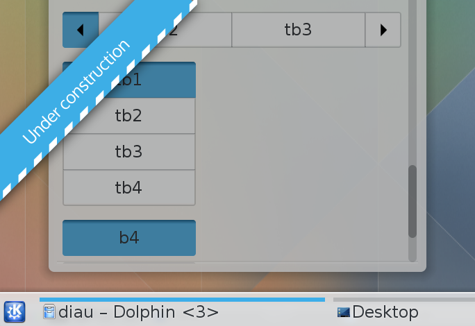
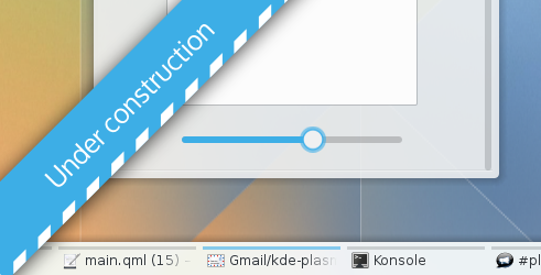
But what about Plasma Next? Well the work is ticking on. The first screenshots from Plasma Next using our light theme are out on Marco Martins blog and everything is being worked on and tested right now to hopefully get into the Alpha of Plasma Next. We've soon to begin the work on a dark theme which hopefully will roll out the doors any second.
As a matter of fact... consider this a rare treat: We've bundled the preview we have that you can use in Plasma Current, it won't look exactly the same and it is massively a WORK IN PROGRESS - but we've added a color theme, an Aurorae theme for the window decoration and a Qtcurve theme for the widget - also a quick fix to make Chrome or Chromium look nice. So don't say we never did anything for you ;)
Now remember, this is massively a work in progress and hardly a final - the clock and logout and other bits need refining (and some lines etc). If you're on Plasma Next then it might be a bit more correct with the correct blurring effect on the panels - but anyway, enough talk you can download a tar of it here! Now it will say "no preview" but just press download and everything is ticketyboo.
All this is due to the massive work undertaken by Andrew Lake of the VDG - Andrew, what would we do without you?
...
Politics. Concerning the recent events in Malmö I just want to add a short #kämpashowan and that during the recent surge of right wing extremist violence and politics in Europe it is important to remember Edmund Burkes words: "the only thing necessary for the triumph for evil is for good men to do nothing", that is all for now and probably the last I will talk about politics in this blog.
Next week we will have some icon work to look at, some refinements to check out with the theme (maybe another sneak preview to our dedicated readers, hmm?) until then, take care!

Is the wallpaper available?
SvaraRaderaEhm yes and no... The wallpaper isn't DONE yet (or so Nuno who made it claims...) and there's only one size of it for now. I don't want to release it unless he says it's ok.
RaderaSoon though... I'll nag him some more ;)
Great work, with the work in progress theme that you posted, the aurora theme seems to have a problem. The right and bottom side border end before the window does. This results in the close button floating in space and no glow.
SvaraRadera@Ethan Adams
SvaraRaderaFor me no glow around the windows is the future not bug :)
All the rest is true ;)
Can't wait for it to be released :) It looks gorgeous
SvaraRaderaJens,
SvaraRaderaI'm not a KDE user, just a admirer. But the energy you bringing to the community is awesome !!
You doing a fantastic working coordinating and motivating all those talented people.
Thank you for everything !!!
omg !!! you are adorable ^_^
SvaraRaderabut is it normal?
SvaraRaderahttp://lh4.ggpht.com/-u0rjYEMtSHo/UyAkD6lgcQI/AAAAAAABUPc/F6k1-p0njzE/s1200/kde-next-theme.jpg
ahhahahaha it is a non ordinary approach ahhahaha
Raderadont we gonna have a github (or a kind of...) repository?
SvaraRadera