
 |
| See that background, behind the "K"? You will see more of it in the future :) |
Another week has flown by, and what a week it has been! We are getting closer and closer to cracking the future themes for Plasma as well as Applications visuals. Ideas for layouts are being hammered together and there is plenty of things milling around in the VDG. Consider this blog the Beta to our Alpha work. We are one step ahead of it but present things as they get nailed definitely. So what you see here is the work done the week before the last.
...
First off lets talk about releases. We all know how these things are supposed to go: some teasing and then at a given date "The Big Reveal". Not so with the next version of Plasma. One of the things that I am so completely over-the-moon about with the way the Plasma Devs are handling the release for Plasma is that it will be done incrementally. What that means is that beyond the basics - the cool backend things, some slight visual changes - the first release of Plasma wont be anything drastic. The next release of Plasma will contain a little bit more in terms of change. The one after that a little bit more.
Why this slow pace? Because it's one thing knowing that your ideas and changes are sound and correct - another to see how we all react to them IRL. By changing bit by bit there is more room for community participation - for everyone to try them, see what they think, give feedback and suggestions and change or add to them if we have to - when there isn't ten thousand different things that are changed, hinging on each others existence to work.
This may not be great for marketing - everyone likes to write about a big splash - but it will be an insane improvement for the community and when the choice is between those two... well you know which side of the toast our bread is buttered on. :-)
...
Then lets talk about community participation! Now you all know that there are plenty of things to take part in the forums I hope? Plenty of ideas waiting to be commented on, plenty of dev's looking for design help. This is one of the best easiest ways to help KDE in a very practical way. Don't be shy. Jump in and get the ball rolling if you have a great idea or better yet look at the ones who need help and we will try to get you in contact with the devs :)
I also want to give a shout-out to one of the community participants for being an inspiration to me personally, you rock! (but who wants to be anonymous sadly)
...
Now let's get down to the moodboard! Two weeks ago this moodboard was posted in our group as a way of describing the theme we chose before that (presented in last weeks Monday Report). Now a moodboard is a way to define and describe the theme and the emotions so that all members of a team can grasp it, find it accessible and as a center around which to communicate further about other ideas.

The tricky bit with moodboards for something so big and complex as the Plasma Next desktop unlike say a printed publication or an ad-campaign is that you often find yourself striking too far out or being too specific - I think this one was a nice mix of it all and shows the look we're going for. Something clean, something futuristic but still bright, "hopeful and human without being too clingy" as it was described. (from top left to bottom right - Eve from Wall-E, City Scape from mirrors edge, "Futuristic City", "Cleaner", Flat Android Icons, Still from 2001 - A Space Odyssey, A lightbulb and a Pantone Card, Still from Mirrors Edge and A redone Star Trek Federation Insignia)
...
Colors. What about colors? The eagle-eyed among you may notice the Pantone card in the moodboard but before you link it with the end result I should post the correct color guide.
Now picking colors is a huge and tricky subject, its dangerous and involved a massive amount of debate. But when one of us (Cuan I think it was) posted the main colors to this we had a winner. The combination of greyscale hinting towards the blue side of the color scale and a stronger and lighter version of blue as main spot color played well together.
Combine that with a broad swath of strong colors from the other sides of the color wheel to counteract the blue-grey scale and use them sparingly to create striking visual change at times - a powerful exclamation mark when needed.
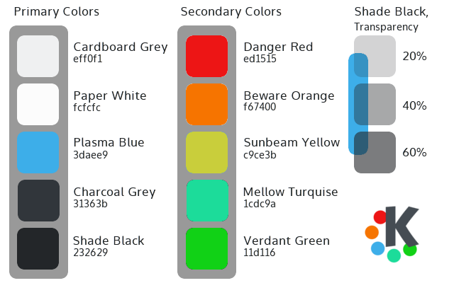
You may notice the transparency levels on the right. We will stick with those three levels of transparencies in all situations to avoid clashes and tricky details that may make: Transparencies are complex - especially in large flat work-communities with a lot of different designers and devs at play.
Now remember that colors are tightly connected to the individual themes - this is for the two base themes that are being planned - but the colors will be used for all visuals for Plasma Next, marketing, logos and imagery, and my hope is that they will find their way into further design work within the KDE application ecosystem.
There is a final tiny thing about colors - Sunburst Yellow - some have claimed that it feels "dirty" or "smudged" - but we will stick to it for now and see how everything pans out.
...
What about icons, well that's an interesting subject - we have some rather interesting news not only about Fabians systemtray icons, Acidtrays icon theme (yes a new icon theme) but also Andrew Lakes icon work. There will be more info of this next monday report.
Another thing coming next week are details on visuals and shapes - there are some nice news coming there too :) (soo many fun things that are still secrets .... iiiih)
So next time - there will be more and more community information coming along and of course next monday more about Plasma.
I have no idea what the result will be, but so much positive energy is refreshing and encouraging. Please keep it coming!
SvaraRaderaThank you! Will do :)
RaderaI love the colors, including "sunbeam yellow" :)
SvaraRaderaKeep up the good work.
I love the way this is going. I think the problem with the "Sunbeam Yellow" is just a brain issue. The color, as is, feels in line with the rest of the color palette (similar tones to the red, orange, and green.
SvaraRaderaI think the problem is with the name of it. The name doesn't match the color. Perhaps something along the lines of mustard yellow or the like. "Sunbeam yellow" would seem to scream out intense or saturated, which the presented color, isn't.
I'm excited to watch this progress.
Den här kommentaren har tagits bort av skribenten.
RaderaI had a second thought.
RaderaOn my monitor, the two light shades and the two dark shades in the first column are very close to one another. Perhaps having a little more separation between them would allow for a little more distinction? My monitor has pretty good color reproduction, but it's not calibrated (beyond brightness/contrast and checking the gamma).
On the big blocks at the top of the blog, they look different enough, but if used together in smaller chunks like in the palette graphic, they look a lot closer together.
Since most/all of the team is graphic designers, I'd be willing to be most use high quality monitors that are color calibrated. If you aren't already, it might be a good idea to check the colors/designs against some lower quality monitors/screens, especially non-calibrated ones, to make sure the quality level translates down to the average user as well.
Regarding color, name, searching for "Sunbeam Yellow", I found this color palette -- http://www.beacongraphics.com/supplies/fdc/fdc-4200-avery.html.
The yellow in the pallet is close to the Primrose Yellow/Rubber Duckie Yellow
Thanks for all the well thought out ideas - the thing about color names is that its just for us to keep them apart when talking about them. Its just damn tricky to refer to them as either "That Green one" or the color code :)
Radera"Sunbeam Yellow" was me having a flashback to when I was 12 and painted warhammer figurines and remember one of the colors in the colorset was "sunburst yellow"... anyway - its not so much descriptive of the color but of its usage.
Then we have to remember that colors are hingent on their surroundings. A leaf for example that, held up against a clear blue sky looks almost radiantly green will look close to grey if held up against something brighter green close to yellow. So its also on its planned usage. Danger Red, Mellow Turquise and Verdant Green for example will probably be the most used of the secondary colors since the first one can be used for "Ah! Do you REALLY want to do this buttons" and the second two for "Apply" buttons.
But this is why the slow release will make so much sense - say that somewhere this summer we all notice that Sunbeam/Sunburst/Mustard/Rubber Duck -yellow simply isn't pulling its weight we have ample time and opportunity to change it. It'll be tricky but not anywhere near as tricky having to do it after an insane amount of changes already done.
Some for more technical issues - sure there are beta-stages and stuff like that - but nothing can compare to the testing a few million users can put it through. Let's just say that since we have a ton of awesome things bubbling - this coming year will be interesting and fun :)
On a small side note, "turquoise" is spelled incorrectly. You've been leaving the "o" out (OpenOffice and Libreoffice had the same problem).
RaderaIt looks good so far. I'm excited by the presentation and the energy the project has.
SvaraRaderaI dont like the secound base for your colors. they just hurt in the eyes.
SvaraRaderaplease have a talk with a UX designer for the colors you use, because beside the yellow one they are all (sorry for this word) crap.
when you craate the "upper" color base just try this: make some sqares in all of your colors, set them next to each other. do this as minimal 16x16, normal 48x48 and big 128x128px size.
now look at them:
if you can look at them without a problem - they are well made.
however. here are some good colors, good for flat things and nice to our eyes http://i.imgur.com/WjCxVD9.png
Well, I'm sorry you don't like the colors personally and would prefer something else. I'll try to explain the tricky bits of UX design and color design here, but bare in mind I can only touch on the basics of the subject:
RaderaPerhaps the text was unclear on its color usage - the secondary colors are used for "breakage" or to build another color layout.
Breakage is sort of like - if you ever saw Schindlers list, the girl in the red dress? To accent something unique - like a "Are you absolutely SURE you want to do this" button.
Then secondary color layouts - those become relevant when individual applications want to use another spot color or combine them differently - to replace for example the "Plasma Blue" spot color with the "Mellow Turquise". This is extra relevant for promo material or when you want to create easily accesible visuals. You can't repeat the same base color scheme.
Now you might think - "why can't you" - which I actually had saved up for another post but in short - there is an issue with Plasma and KDE and that is that KDE is the ecosystem of applications and systems that contain Plasma. Plasma is just the DE (desktop) but the two tend to be confused. Forcing a set color for anything done will not give us enough room to create something visually different from each other (this is of course for Promo material). So it has to do with branding as well - allowing for differences without defining them (which is why the issue is so darn tricky)
(to be continued)
This is the challenge - take another look at our color scheme and you'll see why 13 designers (visual, graphic designers, illustrators, marketers and UX designers) picked that color scheme due to the needs hinging on that choice.
(continued)
RaderaFinally we should perhaps talk about WHY you create a color scheme. When a color scheme is created it is done for a rather specific reason - we did it because we needed a select set of colors for a DE first and foremost but not only. We needed colors that would interact and could be reused in different ways but still create a common framework over which anyone could cooperate to start creating something new.
That means that they needed to give room for individual projects and interpretation but show clearly to any UX designer and Graphics designer what our intended goals where. Hence a cut between Primary and Secondary but including the spot/accent color in the Primary.
This all leads to our fourth consideration and why these colors and this way to present them work:
Organizational work. As I am sure you know Open Source is a unique beast. It has plenty of advantages, the speed of which it developes, the spread of it, the security of it and its willingness to include instead of exclude.
But Design work, especially in combination with the realities of younger designers trying to find work (this is also a whole other issue, one that I will write more on in Full Circle Magazine next months issue) - makes that openness tricky and dangerous. Not to mention the fact that design is such a complex issue balancing as it does not only on trends (more on that next monday report), but on the horrible edge of subjective/objective. It is often seen as wholly subjective - a question of taste where in fact it has to follow many objective rules and considerations that can all be interpreted and handled in a shifting and often subjective ways making it a boggy mire of horrible conversations either forcing the listener into a shared and rather excluding language usage of faux professionalism or of subjective interpretation of a situation that is not fully understood (which I think is what's happening here).
The reason I did this (decided to work for KDE for a year and a day) was to create a functioning design workflow, not hinging on anyones presence that could also combine with the Open Source methods and try to emulate them as much as possible.
This means that ALL design work has to take the flux and differences between various projects into consideration and NOT build a too constructive framework of objects that should be used but instead lead kindly towards a shared layout and design but also allow for change and difference (instead of trying to force one set on all designers).
Open Source design have yet to be properly defined and perfected - and we can either bow out and accept that the design work has to be done in a hidden (lets call it a "proprietary") -way where the work is excluding to onlookers mired with hierarchies and key people who cannot leave OR we can try to construct a new work flow from the ground up.
Design is relevant - but organizational methods are doubly so and I'd be damned if I intend to NOT aim at the stars and try to make something positive for ALL instead of just making good design.
Sry this bit in the end of the first one should have been at the end of the second one... long replies on Blogger is hell :D
Radera"This is the challenge - take another look at our color scheme and you'll see why 13 designers (visual, graphic designers, illustrators, marketers and UX designers) picked that color scheme due to the needs hinging on that choice."
Anyway I hope I have explained why we picked the colors we picked and also why the choice was so tricky